Marketing Dashboards: Why Data Doesn’t Turn Into Decisions
Sarah Moss
June 21, 2026
16
minutes read
Most marketing teams have more performance data on screen than ever before, and fewer confident answers about what to do with it. This article looks at why the modern digital marketing dashboard keeps failing to drive real decisions, the cost it imposes on budget allocation, and what changes once dashboards stop being the destination.
Walk into any marketing review in 2026 and the scene is familiar. Someone shares a screen, a digital marketing dashboard fills it, the team scrolls through panels of CTR and conversion rates, nods at the green numbers, frowns at the red ones, and agrees to "keep an eye on it." Few decisions get made. Fewer get made fast. The data is there — more of it, cleaner than before, refreshed in something close to real time — and the budget meeting closes with the same allocations it opened with.
The premise of this piece is straightforward: marketing dashboards were built to monitor, with the work of deciding left to whoever uses them. They are the surveillance camera of the marketing function — present, operational, watched, but not designed to issue the order that follows. Visibility was the problem dashboards were created to solve, and on that count they have largely succeeded. Decision support is a separate problem entirely, and it is the one that matters most now that marketing budgets are flat at 7.7% of revenue and 59% of CMOs say they have insufficient budget to execute their 2025 strategy, with paid media accounting for nearly a third of every marketing dollar. When budgets are static, the quality of each reallocation decision compounds. A dashboard that produces hesitation instead of action stops being a neutral tool. It becomes a tax on the only resource the team has left.
What follows is a diagnosis of why digital marketing dashboards keep failing at the decision step, an account of where the failure tends to live (often outside the dashboard itself), three principles for decision-driven marketing, and a four-step framework for turning a digital marketing reporting dashboard into something a team can actually act on.
What digital marketing dashboards do?
A digital marketing dashboard is, at its plainest, a visual interface that consolidates campaign and channel performance into a single view. It pulls from ad platforms, web analytics, CRMs, and increasingly from offline sources, and arranges the result in panels and charts that update on a defined cadence. As reporting infrastructure, it does several jobs well. As decision infrastructure, it has limits worth naming clearly before any conversation about fixing them begins.
What digital marketing dashboards do well
The everyday role of a digital marketing performance dashboard is to provide visibility across channels, teams, and time.
A CMO with twelve campaigns running across paid search, social, programmatic display, CTV, and retail media gets a unified read of impressions, clicks, conversions, CPA, and CPM in one place rather than logging into seven platforms in seven tabs. A performance team can spot anomalies — a sudden drop in conversion rate on a high-spend campaign, an unexpected spike in CPC — far faster than they could from raw platform reports. Reporting cadences flatten: weekly stakeholder reviews, quarterly board decks, and monthly client updates all source from the same set of definitions, which makes the conversation about performance more consistent.
Aggregation is the second strength. Dashboards consolidate data that would otherwise sit in disparate systems and make it browsable. They can be filtered by region, audience, format, or campaign objective without an analyst rebuilding a query each time. They serve as a shared reference point across marketing, finance, and leadership — useful precisely because everyone is looking at the same numbers.
The third strength is documentation. A digital marketing report dashboard creates a record of what happened, when, and at what cost, which is invaluable for post-campaign analysis, agency review, and compliance reporting. None of this is trivial work, and dashboards do it at a scale and speed that no manual reporting process could match.
Where digital marketing dashboards stop
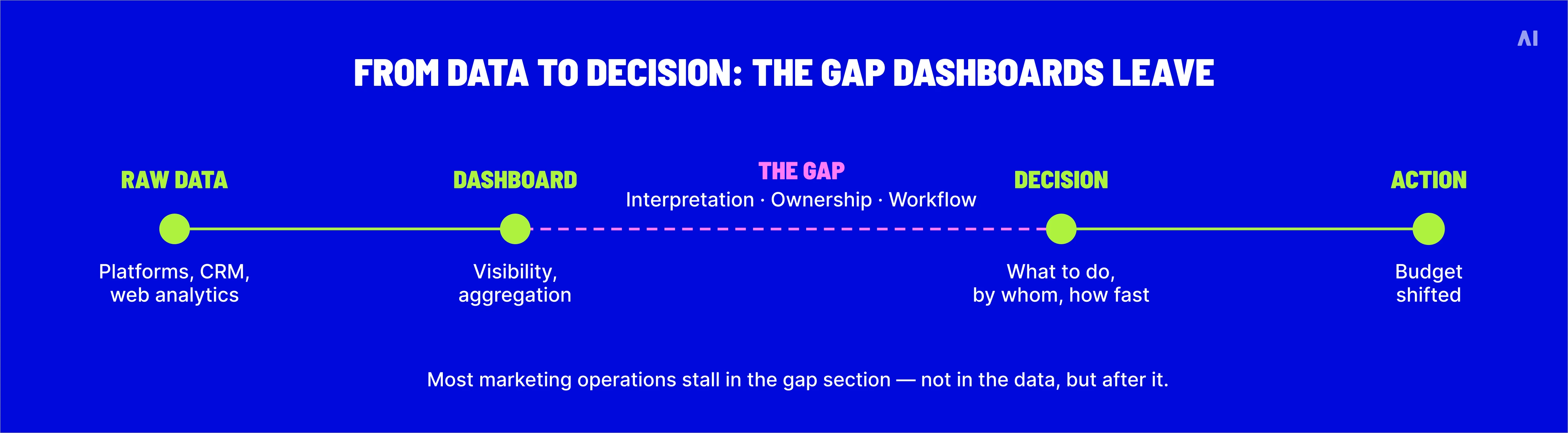
What dashboards do not do is interpret. They show that conversion rate fell 12% week-over-week without saying whether the drop reflects creative fatigue, audience saturation, a tracking gap, a seasonal pattern, or competitive pressure. They show that CPA on a search campaign rose without indicating whether the right response is to lower bids, change keywords, refresh creative, or accept the rise as the cost of scale. The information needed to make that judgment lives somewhere outside the dashboard — in the analyst's head, in a separate research tool, in a meeting that has not yet happened — and the dashboard's job ends at the surfacing of the change.
The most consequential thing to say plainly is this: dashboards report; they do not recommend. The further work of deciding what to do is left to humans operating with partial context, time pressure, and the cognitive challenge of holding a dozen contradictory signals in mind at once.
In a high-functioning team that works. In most teams it produces hesitation, and hesitation has a price — the campaign that should have been scaled three days earlier; the audience segment that kept burning budget for a week before anyone moved it.
From data to decision: the gap dashboards leave
Why dashboards fail in practice
The mechanical reasons digital marketing dashboards struggle at the decision step are not mysterious. Four issues recur, often together, and each one degrades the link between what the dashboard shows and what the team can confidently do.
Too many metrics, no priorities
The first failure is taxonomy. Most digital marketing dashboards present every available metric with equal visual weight. CTR sits next to conversion rate sits next to CPM sits next to viewability sits next to bounce rate, none of them obviously more important than the next, none of them flagged as the metric that should drive a budget decision. Faced with thirty indicators on a single screen, a marketing team treats them all as roughly equivalent — and ends up acting on none of them with confidence.
The cognitive load is real. Marketing leaders do not have the time to interrogate thirty metrics; they have the time to look at three or four, and the dashboard that fails to make those three or four obvious leaves them deciding by intuition or platform default. The dashboard's effort to be comprehensive becomes the reason it cannot be useful.
Channel silos
The second failure is structural. Most dashboards are stitched together from platform exports, and platforms do not speak to each other in the same dialect. A Google Ads export defines a "conversion" differently from a Meta export, which defines it differently from a CTV measurement vendor's report, which defines it differently from a retail media network's attribution. The dashboard layers these disagreements on top of each other and presents the result as a unified read. It is not. The team is looking at four reports masquerading as one.
The consequence shows up most clearly when budget reallocation is on the table. Without comparable channel data, "shift 15% from Meta to retail media" is a guess dressed in dashboard formatting.
According to Forrester's Q3 2024 B2C Marketing CMO Pulse Survey, 78% of US B2C marketing executives concede that their marketing and loyalty technologies are siloed — a structural admission that the data feeding most dashboards cannot be reconciled without significant additional work.
The third failure is what dashboards prioritize. Default views surface platform-native metrics — CTR, CPC, CPM, impressions — because that is what the underlying systems were built to report. Revenue, profit, and ROI tend to live elsewhere, in the finance system or the BI tool, requiring a separate pass to reconcile. The result is a marketing team optimizing toward metrics the platforms care about, while the metrics the business cares about live one report away.
A campaign with an excellent CTR and a poor contribution to revenue is a failure regardless of how good the CTR looks.
A campaign with a mediocre CTR and a strong contribution to revenue is a success the dashboard quietly underrates.
The mismatch is the difference between scaling something that works and scaling something that looks like it works.
Delayed data
The fourth failure is timing. Dashboards reflect what already happened. Even "real-time" dashboards typically run on data that is hours old, sometimes a full day old, depending on how attribution windows close, when conversion data arrives, and when the platform last updated. By the time a problem is visible, the campaign that caused it has been running with the same misallocation for a measurable period.
For some decisions — a quarterly review, a brand-lift analysis — the latency is fine. For budget reallocation in a fast-moving programmatic environment, where bids and audiences shift hourly, latency is structural cost. The longer the lag between a change in performance and a change in spend, the more budget is wasted in between. Most dashboards do not surface this latency at all; they present yesterday's numbers as if they were today's.
Beneath the mechanical failures sits a cognitive one, and it is the more dangerous of the two. A well-designed dashboard makes incomplete data feel sufficient. The polish of the interface — the consistent typography, the clean charts, the color-coded green and red — gives the impression that the underlying numbers have been vetted, reconciled, and rendered trustworthy. They have been formatted; vetting is a separate step that may or may not have happened.
The result is a particular kind of overconfidence in marketing decisions: teams act decisively on data that is structurally fragmented, methodologically inconsistent, and frequently out of date, because the dashboard tells them they are looking at "the numbers" rather than "a partial view of the numbers, formatted for executive consumption."
Academic research on dashboard visualizations has documented how visual representation of information can lead to biased decision-making and overemphasis on certain metrics simply because they are visually prominent. The dashboard's polish is its own argument for action, and the argument is occasionally wrong.
The second-order effect is harder to reverse. Once a team has scaled a campaign on the basis of a confident-looking dashboard read, the campaign's ongoing performance is interpreted through the same lens. Confirmation bias compounds: numbers that support the original decision get trusted; numbers that contradict it get explained away as anomalies. The dashboard becomes the rationale for both the original move and the reluctance to undo it.
The fix is not to make dashboards less visually polished. It is to require the team using them to ask, before any decision, what is missing from the view — which channels do not feed into it, which metrics have a methodology question hanging over them, which numbers are trailing real-world activity by twenty-four or forty-eight hours. The discipline of asking what the dashboard is not showing is the single most effective protection against the overconfidence the dashboard quietly invites.
⚡ The dashboard's polish is its own argument for action — and the argument is occasionally wrong.
The real bottleneck is decision-making
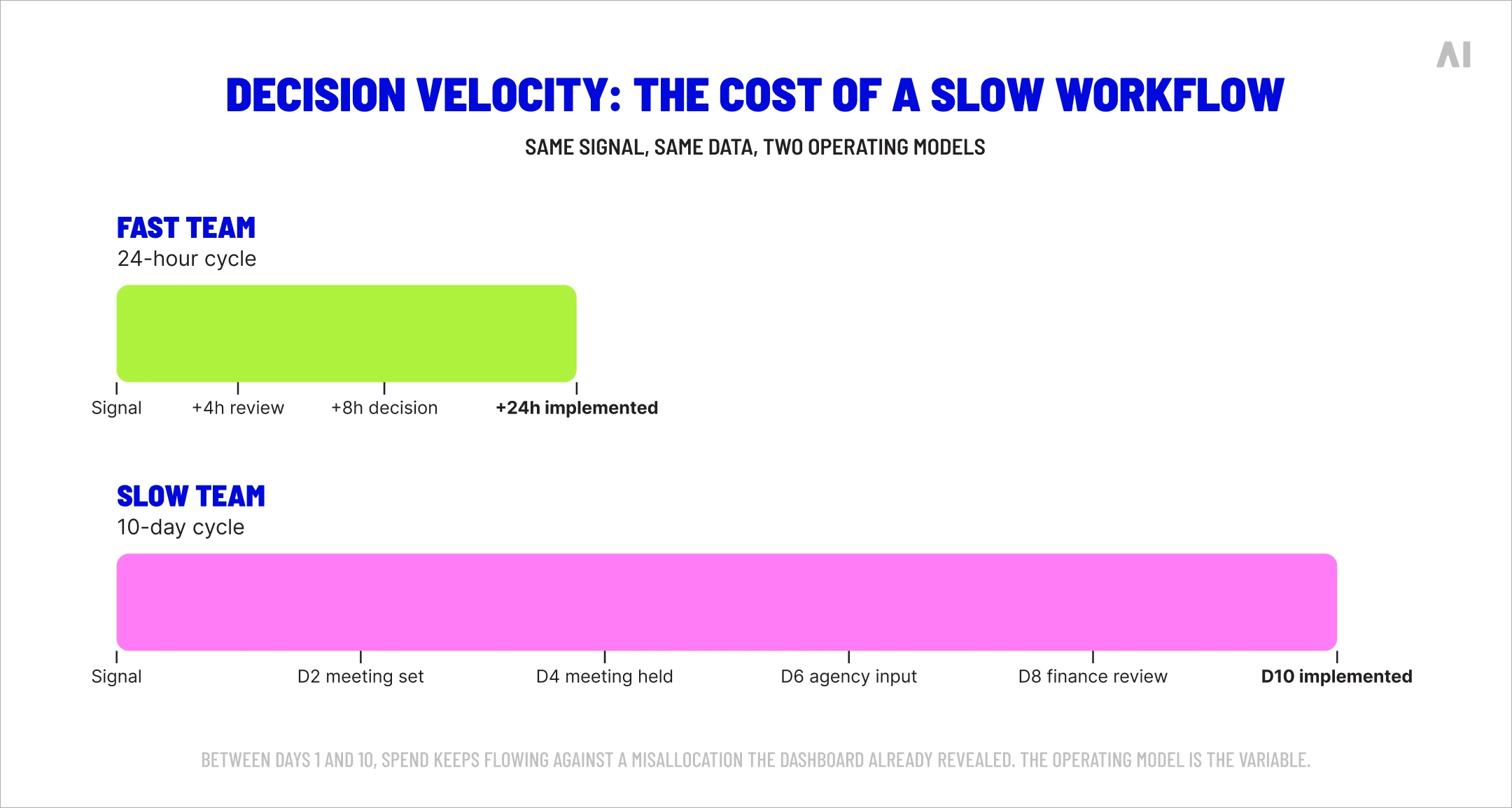
Even when the data is clean, comparable, current, and prioritized — even when the dashboard does its job perfectly — most marketing teams still take longer to make budget decisions than the underlying data would justify. The bottleneck sits in the team's operating model, not in the dashboard.
The pattern is familiar. The data shows a clear underperforming campaign that needs to be cut. The decision sits in someone's queue. A meeting has to happen. The agency needs to weigh in. Finance wants to understand the implications. Two weeks later the spend has been throttled — and the campaign has been bleeding money the whole time. None of that delay was caused by the dashboard. All of it was caused by unclear ownership of the decision, unclear thresholds for action, and the political work of getting alignment around a change.
The 2025 ANA Measurement & Analytics Conference framed this directly: the goal, in the words of one agenda item, is "elevating analytics from dashboards to decisions — and from metrics to meaning." The implication is that the work of decision-making — who owns which call, what triggers a reallocation, how fast the team can move from a signal to an action — is its own discipline, distinct from the work of measurement, and most marketing organizations under-invest in it.
The point is operational rather than analytical. A team that can move budget within twenty-four hours of a signal will outperform a team that takes ten days, even if both teams are looking at the same dashboard. Decision velocity, not data quality, is the variable that separates teams whose dashboards drive performance from teams whose dashboards merely document it.
Decision velocity: the cost of a slow workflow.
⚡ A team that can move budget within twenty-four hours of a signal will outperform a team that takes ten days, even if both teams are looking at the same dashboard.
Principles of decision-driven marketing
Before listing remedies, three principles are worth stating, because each one inverts a habit that most digital marketing dashboards quietly reinforce.
Decisions come before data
The instinct is to start with available data and ask what it suggests. Decision-driven marketing reverses the order. The team identifies the decisions it needs to make — which campaigns to scale, which to cut, which audiences to expand, which to retire — and then builds the data view that supports each decision. Metrics that do not connect to a decision do not earn a place on the dashboard.
The discipline is harder than it sounds. Most reporting is built additively: someone asks for a metric, the metric gets added, no one ever removes it. Over time the dashboard becomes a museum of every question anyone has asked of marketing in the last three years. Working back from the decision, rather than forward from the data, is the only way to clear the museum.
Business outcomes over platform metrics
CTR and CPC are platform metrics. Revenue, customer acquisition cost, lifetime value, and contribution margin are business metrics. Dashboards skew toward the first because the platforms generate them; teams should skew toward the second because that is what the business is paying marketing to deliver.
The mismatch is operational. A team that optimizes a campaign toward platform-defined CPA can hit its target while losing money for the business, because the conversions the platform counts and the conversions the finance team counts are different events.
The corrective is not to abandon platform metrics. It is to demote them to diagnostic status. CTR is useful for evaluating creative; it is not the metric that justifies a spend reallocation. ROAS, contribution margin, and incrementality are.
Cross-channel performance matters
The third principle: no single channel's report is sufficient evidence for a budget decision that affects the channel mix. Reallocating from social to CTV requires a view of how those two channels interact, what the marginal return on each looks like at the current spend level, and what the diminishing-return curves predict for incremental investment. None of that lives in a single platform's dashboard. It has to be assembled, deliberately, from comparable cross-channel data.
This is where most dashboards quietly break. They aggregate channel data without normalizing the underlying definitions, leaving the team with the impression of a unified view and the reality of a stack of disagreeing reports. Decision-driven cross-channel reporting and channel-by-channel reporting on a single screen are different products, even when they look the same.
4 steps to turn dashboards into decision tools
Once the principles are agreed, the practical work begins. The point of the four steps below is not to redesign the dashboard for its own sake; it is to align dashboard, data, and workflow so the team can move from "we see what happened" to "we know what to do about it" inside a working day.
A note on what these steps cannot fix on their own. Restructuring a dashboard helps, but the underlying problem — fragmented data feeding inconsistent measurement — does not go away because the panels have been rearranged. At a certain scale, the team needs a connected system that handles data unification, measurement, and recommendation as a single layer rather than four discrete tools held together with quarterly cleanups. That layer is what the industry has begun calling a marketing intelligence platform, and the AI Digital section that follows describes how the connection works in practice.
1. Define key decisions and owners
Begin with a written list of the decisions the team makes about budget — not in the abstract, but the actual recurring calls. Reallocate spend across channels, scale or cut a specific campaign, expand or retire an audience segment, adjust frequency caps, change creative rotation. For each decision, name the person who owns the call, the threshold that triggers the conversation, and the expected speed of the response.
This work tends to expose three problems at once.
Most teams have decisions without owners — the call about whether to keep funding an underperforming retail media partner sits across three desks and never lands.
Most teams have decisions without thresholds — there is no shared rule for when "underperforming" becomes "cut", which means the decision is renegotiated every time.
And most teams have decisions without speed expectations — a 10% spend shift takes the same week-long approval cycle as a $2 million strategic call.
Naming all three explicitly is the foundation for everything that follows.
2. Map dashboard metrics to decisions
With decisions and owners listed, the dashboard becomes a fixable object rather than an inherited one. Each metric on the dashboard should be tied to a specific decision; metrics that do not support a decision either get demoted to a drill-down view or removed altogether.
The exercise is uncomfortable. Most dashboards include metrics for political reasons — a stakeholder asked for it once, a previous CMO liked it, the agency reports against it — rather than because the metric drives a current decision. Cutting these requires a conversation rather than a configuration change.
The reward is a dashboard whose remaining metrics each have a job to do, which makes the dashboard itself a faster instrument.
3. Build a decision workflow
A decision workflow is the documented sequence the team runs when a trigger fires. It specifies who reviews the data, who consults whom, who signs off, and how the change is communicated downstream. Without one, every decision is a fresh negotiation, and the negotiation is what introduces the lag.
The simplest workable version: dashboard surfaces a trigger; the named owner reviews within twenty-four hours; the owner consults the relevant stakeholders within forty-eight; the change is implemented within seventy-two; the change is documented in a decision log that the next review can reference. The process should be boring on purpose. Boring is the operational form of fast.
4. Remove non-actionable metrics
The final step is the one teams resist. Dashboards accrete; they rarely shrink. A digital marketing dashboard with sixty metrics is a less useful instrument than one with twelve, because every additional metric dilutes the team's attention on the metrics that matter. The exercise of cutting concentrates decision-making power into the smallest set of indicators that reliably drives action.
What gets cut: vanity metrics that no one optimizes against; platform-default metrics that duplicate something more useful; legacy metrics from campaigns that ended six quarters ago; aggregate metrics that hide rather than illuminate variation. What stays: the metrics tied to a named decision, an owner, and a threshold.
How AI Digital turns fragmented data into decisions
The four steps above describe a discipline. A discipline is necessary, but at scale it strains against the underlying infrastructure problem: fragmented platforms, inconsistent measurement, and reporting tools that were not built to talk to each other. Maintaining a clean decision-driven dashboard on top of this infrastructure becomes its own full-time effort, and the work of running campaigns suffers for it.
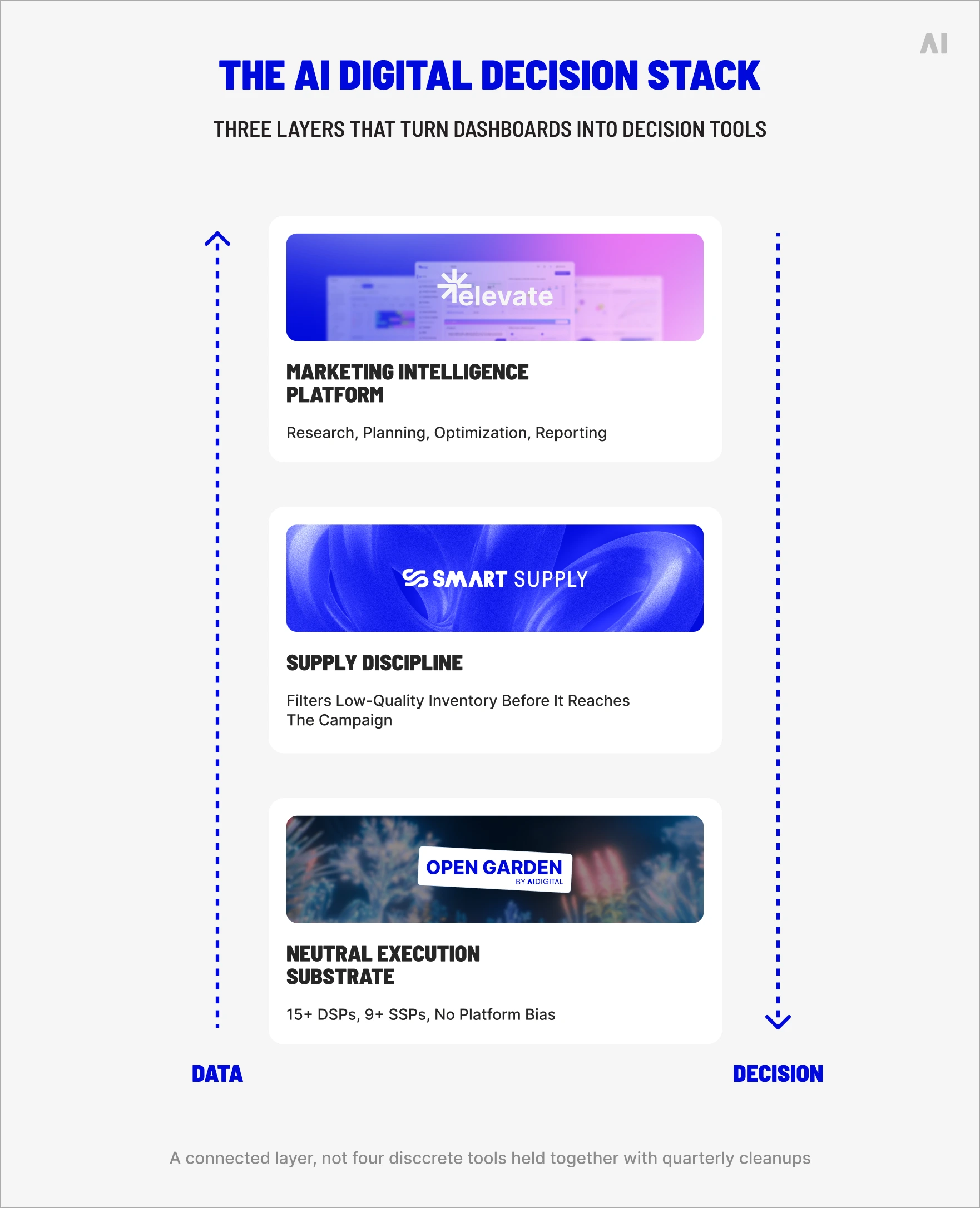
AI Digital's premise is that the dashboard problem is downstream of the data problem, and the data problem is downstream of how platforms, supply, and measurement are connected. The combination of Elevate, Smart Supply, and the Open Garden Framework operates as a single intelligence layer that handles unification, measurement, and recommendation in concert — turning the dashboard from a passive report into part of an active decision system.
The AI Digital decision stack.
Smarter decisions with Elevate
Elevate is AI Digital's vendor-agnostic Marketing Intelligence Platform. It unifies research, planning, optimization, and reporting in one layer, drawing on 150 billion data points monthly and analysis of more than a million audiences. The practical effect for the dashboard problem is that Elevate produces a single decision view rather than a stack of platform reports, and pairs that view with AI-powered recommendations that close the gap between observation and action.
Three modules do the heaviest decision-support work.
AI Audience Segments converts a target audience description into channel-specific segments matched against behavioral and customer signals — feeding planning rather than asking the team to translate insight into setup.
The AI-Assisted Media Planner draws on data from more than 8,000 campaigns across 12+ DSPs and 100,000+ placements to recommend plans that have a defensible basis rather than an intuitive one.
And Path to Conversion maps the full sequence of touchpoints leading to a conversion, replacing last-click attribution with a view of how channels actually combine — which is the missing piece for most cross-channel reallocation decisions.
The shift Elevate enables is from descriptive to prescriptive. The team moves from "the dashboard says CTR fell" to "the dashboard says CTR fell, the system has identified three plausible causes, and here is the recommended response — pending your approval." That is a different operating posture, and it is the one most marketing teams are trying to reach.
Better efficiency with Smart Supply
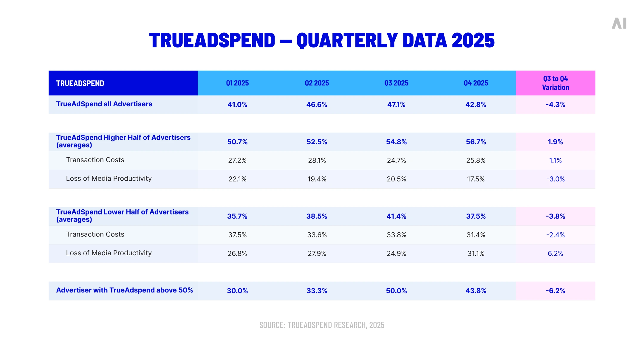
The dashboard's view of campaign performance is only as honest as the inventory feeding it. Smart Supply addresses the layer that most dashboards do not show: the supply path between bid and impression. AI-powered selection and filtering removes low-quality and fraudulent inventory before it reaches the campaign, which means the conversion data on the dashboard reflects real engagement rather than the artifacts of bid stream recycling and inflated supply paths.
The relevance for decision-making is direct. A team optimizing a CTV campaign on the basis of dashboard data alone will scale toward what looks like high performance — except a meaningful portion of that performance can be inflated by supply-path inefficiency, where the same impression is sold and resold across SSPs, the cost rising at each hop.
The ANA's Q4 2025 Programmatic Transparency Benchmark found that advertisers enforcing quality discipline converted approximately 50% more of their spend into TrueAdSpend — a margin that goes directly to performance the dashboard could not previously see.
In practical terms, Smart Supply gives the dashboard data it can be trusted with. The decisions made on top of it become more reliable because the underlying signal is cleaner — and the budget reallocation that follows reaches working media rather than ad-tech overhead.
Unified ecosystem with the Open Garden Framework
The third piece is the connective tissue. The Open Garden Framework is AI Digital's DSP-agnostic execution layer, connecting across 15+ DSPs and 9+ SSPs without favoring any single platform's owned inventory or measurement preferences. For the dashboard, this matters because the data flowing into Elevate comes from a deliberately neutral substrate rather than a platform's self-interested view.
The implication for decision-driven reporting is structural.
A dashboard built on top of platform-favored execution will, by default, surface metrics that flatter the platform's role in performance.
A dashboard built on top of the Open Garden Framework surfaces metrics that reflect the campaign's actual cross-platform behavior.
The difference shows up most clearly in attribution and reallocation decisions, where neutral underlying execution means the channel comparisons in the dashboard are comparing like with like.
Combined, the three pieces — Elevate as the intelligence layer, Smart Supply as the supply discipline, Open Garden as the execution substrate — turn the dashboard from a downstream observer into an integrated decision tool, with the data, the recommendations, and the underlying activation working as a single system.
Growth comes from decisions, not dashboards
A digital marketing performance dashboard, in 2026, is necessary but not sufficient. The visibility it provides is real and worth keeping. The decision support it does not provide is the gap that costs teams quarter after quarter — in budget that sits misallocated for days at a time, in scaling decisions made on incomplete data, in reallocations delayed past the moment they would have mattered.
Closing the gap requires three things in combination: data unified at the layer below the dashboard, measurement consistent enough to drive cross-channel decisions, and a workflow that translates signals into actions inside a working day rather than a working fortnight. Without those, a better dashboard produces better-looking inertia. With them, an ordinary dashboard becomes an operating instrument.
If a team's reporting is producing observations rather than decisions, the question to bring to AI Digital is not which dashboard to install. It is how to connect the layer underneath. AI Digital combines Elevate (the marketing intelligence layer), Smart Supply (the supply discipline that gives the data its integrity), and the Open Garden Framework (the neutral execution substrate) so that the decisions a team needs to make have somewhere to land. Get in touch and we'll show you how the layers connect.
Blind spot
Key issues
Business impact
AI Digital solution
Lack of transparency in AI models
• Platforms own AI models and train on proprietary data • Brands have little visibility into decision-making • "Walled gardens" restrict data access
• Inefficient ad spend • Limited strategic control • Eroded consumer trust • Potential budget mismanagement
Open Garden framework providing: • Complete transparency • DSP-agnostic execution • Cross-platform data & insights
Optimizing ads vs. optimizing impact
• AI excels at short-term metrics but may struggle with brand building • Consumers can detect AI-generated content • Efficiency might come at cost of authenticity
• Short-term gains at expense of brand health • Potential loss of authentic connection • Reduced effectiveness in storytelling
Smart Supply offering: • Human oversight of AI recommendations • Custom KPI alignment beyond clicks • Brand-safe inventory verification
The illusion of personalization
• Segment optimization rebranded as personalization • First-party data infrastructure challenges • Personalization vs. surveillance concerns
• Potential mismatch between promise and reality • Privacy concerns affecting consumer trust • Cost barriers for smaller businesses
Elevate platform features: • Real-time AI + human intelligence • First-party data activation • Ethical personalization strategies
AI-Driven efficiency vs. decision-making
• AI shifting from tool to decision-maker • Black box optimization like Google Performance Max • Human oversight limitations
• Strategic control loss • Difficulty questioning AI outputs • Inability to measure granular impact • Potential brand damage from mistakes
Managed Service with: • Human strategists overseeing AI • Custom KPI optimization • Complete campaign transparency
Fig. 1. Summary of AI blind spots in advertising
Dimension
Walled garden advantage
Walled garden limitation
Strategic impact
Audience access
Massive, engaged user bases
Limited visibility beyond platform
Reach without understanding
Data control
Sophisticated targeting tools
Data remains siloed within platform
Fragmented customer view
Measurement
Detailed in-platform metrics
Inconsistent cross-platform standards
Difficult performance comparison
Intelligence
Platform-specific insights
Limited data portability
Restricted strategic learning
Optimization
Powerful automated tools
Black-box algorithms
Reduced marketer control
Fig. 2. Strategic trade-offs in walled garden advertising.
Core issue
Platform priority
Walled garden limitation
Real-world example
Attribution opacity
Claiming maximum credit for conversions
Limited visibility into true conversion paths
Meta and TikTok's conflicting attribution models after iOS privacy updates
Data restrictions
Maintaining proprietary data control
Inability to combine platform data with other sources
Amazon DSP's limitations on detailed performance data exports
Cross-channel blindspots
Keeping advertisers within ecosystem
Fragmented view of customer journey
YouTube/DV360 campaigns lacking integration with non-Google platforms
Black box algorithms
Optimizing for platform revenue
Reduced control over campaign execution
Self-serve platforms using opaque ML models with little advertiser input
Performance reporting
Presenting platform in best light
Discrepancies between platform-reported and independently measured results
Consistently higher performance metrics in platform reports vs. third-party measurement
Fig. 1. The Walled garden misalignment: Platform interests vs. advertiser needs.
Key dimension
Challenge
Strategic imperative
ROAS volatility
Softer returns across digital channels
Shift from soft KPIs to measurable revenue impact
Media planning
Static plans no longer effective
Develop agile, modular approaches adaptable to changing conditions
Brand/performance
Traditional division dissolving
Create full-funnel strategies balancing long-term equity with short-term conversion
Capability
Key features
Benefits
Performance data
Elevate forecasting tool
• Vertical-specific insights • Historical data from past economic turbulence • "Cascade planning" functionality • Real-time adaptation
• Provides agility to adjust campaign strategy based on performance • Shows which media channels work best to drive efficient and effective performance • Confident budget reallocation • Reduces reaction time to market shifts
• Dataset from 10,000+ campaigns • Cuts response time from weeks to minutes
• Reaches people most likely to buy • Avoids wasted impressions and budgets on poor-performing placements • Context-aligned messaging
• 25+ billion bid requests analyzed daily • 18% improvement in working media efficiency • 26% increase in engagement during recessions
Full-funnel accountability
• Links awareness campaigns to lower funnel outcomes • Tests if ads actually drive new business • Measures brand perception changes • "Ask Elevate" AI Chat Assistant
• Upper-funnel to outcome connection • Sentiment shift tracking • Personalized messaging • Helps balance immediate sales vs. long-term brand building
• Natural language data queries • True business impact measurement
Open Garden approach
• Cross-platform and channel planning • Not locked into specific platforms • Unified cross-platform reach • Shows exactly where money is spent
• Reduces complexity across channels • Performance-based ad placement • Rapid budget reallocation • Eliminates platform-specific commitments and provides platform-based optimization and agility
• Coverage across all inventory sources • Provides full visibility into spending • Avoids the inability to pivot across platform as you’re not in a singular platform
Fig. 1. How AI Digital helps during economic uncertainty.
Trend
What it means for marketers
Supply & demand lines are blurring
Platforms from Google (P-Max) to Microsoft are merging optimization and inventory in one opaque box. Expect more bundled “best available” media where the algorithm, not the trader, decides channel and publisher mix.
Walled gardens get taller
Microsoft’s O&O set now spans Bing, Xbox, Outlook, Edge and LinkedIn, which just launched revenue-sharing video programs to lure creators and ad dollars. (Business Insider)
Retail & commerce media shape strategy
Microsoft’s Curate lets retailers and data owners package first-party segments, an echo of Amazon’s and Walmart’s approaches. Agencies must master seller-defined audiences as well as buyer-side tactics.
AI oversight becomes critical
Closed AI bidding means fewer levers for traders. Independent verification, incrementality testing and commercial guardrails rise in importance.
Fig. 1. Platform trends and their implications.
Metric
Connected TV (CTV)
Linear TV
Video Completion Rate
94.5%
70%
Purchase Rate After Ad
23%
12%
Ad Attention Rate
57% (prefer CTV ads)
54.5%
Viewer Reach (U.S.)
85% of households
228 million viewers
Retail Media Trends 2025
Access Complete consumer behaviour analyses and competitor benchmarks.
Identify and categorize audience groups based on behaviors, preferences, and characteristics
Michaels Stores: Implemented a genAI platform that increased email personalization from 20% to 95%, leading to a 41% boost in SMS click through rates and a 25% increase in engagement.
Estée Lauder: Partnered with Google Cloud to leverage genAI technologies for real-time consumer feedback monitoring and analyzing consumer sentiment across various channels.
High
Medium
Automated ad campaigns
Automate ad creation, placement, and optimization across various platforms
Showmax: Partnered with AI firms toautomate ad creation and testing, reducing production time by 70% while streamlining their quality assurance process.
Headway: Employed AI tools for ad creation and optimization, boosting performance by 40% and reaching 3.3 billion impressions while incorporating AI-generated content in 20% of their paid campaigns.
High
High
Brand sentiment tracking
Monitor and analyze public opinion about a brand across multiple channels in real time
L’Oréal: Analyzed millions of online comments, images, and videos to identify potential product innovation opportunities, effectively tracking brand sentiment and consumer trends.
Kellogg Company: Used AI to scan trending recipes featuring cereal, leveraging this data to launch targeted social campaigns that capitalize on positive brand sentiment and culinary trends.
High
Low
Campaign strategy optimization
Analyze data to predict optimal campaign approaches, channels, and timing
DoorDash: Leveraged Google’s AI-powered Demand Gen tool, which boosted its conversion rate by 15 times and improved cost per action efficiency by 50% compared with previous campaigns.
Kitsch: Employed Meta’s Advantage+ shopping campaigns with AI-powered tools to optimize campaigns, identifying and delivering top-performing ads to high-value consumers.
High
High
Content strategy
Generate content ideas, predict performance, and optimize distribution strategies
JPMorgan Chase: Collaborated with Persado to develop LLMs for marketing copy, achieving up to 450% higher clickthrough rates compared with human-written ads in pilot tests.
Hotel Chocolat: Employed genAI for concept development and production of its Velvetiser TV ad, which earned the highest-ever System1 score for adomestic appliance commercial.
High
High
Personalization strategy development
Create tailored messaging and experiences for consumers at scale
Stitch Fix: Uses genAI to help stylists interpret customer feedback and provide product recommendations, effectively personalizing shopping experiences.
Instacart: Uses genAI to offer customers personalized recipes, mealplanning ideas, and shopping lists based on individual preferences and habits.
Medium
Medium
Share article
Url copied to clipboard
No items found.
Subscribe to our Newsletter
THANK YOU FOR YOUR SUBSCRIPTION
Oops! Something went wrong while submitting the form.
Questions? We have answers
Why don't marketing dashboards lead to better decisions?
Because dashboards are built to monitor activity rather than recommend action. They surface what changed, but they don't interpret why, prioritize the response, or assign ownership of the decision. Without those layers, a dashboard becomes a record of performance rather than a driver of it—a documentation tool the team consults rather than acts on.
What is the biggest problem with digital marketing dashboards?
The single largest problem is that most dashboards aggregate platform reports without reconciling their underlying definitions, leaving teams with what looks like a unified view but is actually a stack of disagreeing reports. Compounding the issue, dashboards rarely distinguish between metrics that should drive decisions (revenue, ROAS, CAC) and metrics that describe activity (CTR, CPC), so teams end up optimizing toward the wrong layer.
Why do dashboards lead to poor budget allocation?
Dashboards present platform-level efficiency as if it were business efficiency. A campaign with strong CTR and weak revenue contribution looks like a winner on the dashboard, and budget tends to follow what looks efficient rather than what is profitable. Add fragmented measurement across channels and there is no honest way to compare like with like, which is the foundation of every budget reallocation decision.
What's the difference between dashboards and marketing intelligence?
A dashboard is a presentation layer. It shows what happened. Marketing intelligence is a decision layer that connects data, applies analytics and AI, surfaces recommended actions, and feeds those recommendations back into campaign management. The two are complementary—most marketing intelligence platforms include dashboards—but they answer different questions. The dashboard answers "what?". The intelligence layer answers "what next?"
How can you turn dashboard data into real decisions?
Begin with the decisions the team makes, not the data the platforms produce. List the recurring budget calls, name the owner of each, define the trigger threshold and the expected response speed, then map dashboard metrics back to those decisions and remove the rest. The process strips the dashboard down to its decision-supporting core and gives every remaining metric a job.
Why do teams fail to act on dashboard insights?
Most often because the operating model around the dashboard is undefined. A clear signal in the data does not produce action when there is no named owner, no agreed threshold for what counts as "act-worthy", and no documented workflow from observation to decision to implementation. The data may be perfect; the bottleneck is downstream of it, in how the team is organized to respond.
Are dashboards still useful in marketing?
Yes—they remain the most efficient way to provide visibility across channels, teams, and time. The mistake is treating them as the destination rather than the starting point. A digital marketing dashboard is a strong reporting instrument and a poor decision instrument, and a marketing operation built around it without the layers above and below produces a great deal of looking and not nearly enough deciding.
Have other questions?
If you have more questions, contact us so we can help.

.svg)
.svg)